[vc_row][vc_column][vc_column_text dp_text_size=”size-4″]What would you draw if you were asked to draw the Pepsi logo from memory? Perhaps a circle with the brand’s signature red, white, and blue stripes. Probably the word “Pepsi” in that globe.
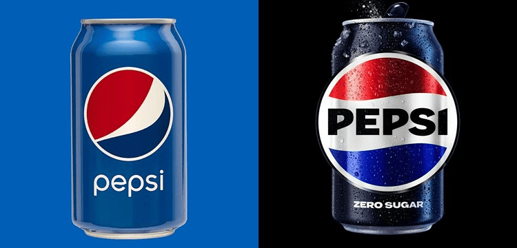
When PepsiCo walks people through this exercise, which it occasionally does, the majority of them do the same thing: they put the word “Pepsi” in the circle. However, that is not how the current logo appears. The brand name is off to the side, looking a little timid next to the iconic globe. So Pepsi is making a switch.
“We couldn’t ignore that kind of insight,” PepsiCo’s chief design officer, Mauro Porcini, told “Rather than rejecting it, we chose to embrace it.”
Pepsi unveiled a new logo and branding on Tuesday, which will be available in North America this fall and globally next year. It resembles the 1990s version that seems to have stuck in people’s minds, but with new elements to make it more modern, such as a different font and font colour, as well as a new border. The changes are intended not only to better align with people’s memories, but also to draw attention to Pepsi’s zero sugar line, which is an important part of the company’s growth strategy.
Also Read: Nokia changes its logo and brand identity after 60 years.
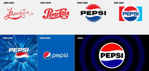
Pepsi has been around for 125 years and updates its branding on a regular basis. In 2008, the current visual identity was introduced. But it’s become a little stale in the years since it first appeared.
According to Todd Kaplan, Pepsi’s chief marketing officer, the “Pepsi” in the logo “is decoupled from the globe.” “It’s this lowercase, italicised font, with a slightly muted blue… It lacks the confidence and energy that the brand truly represents.”
‘Bold and Confident’
According to Kaplan, Pepsi is a “bold and confident brand” that stands for “unapologetic enjoyment.” The current logo, with its lower-case “pepsi” standing apart from the relaxed globe? Not very daring or confident.
The new logo, with its punchy, upper-case “PEPSI” emblazoned across the white stripe undulating between the red and blue waves, is more like it.
Companies frequently change their appearance in order to remain relevant, according to Tim Calkins, a marketing professor at Northwestern University’s Kellogg School of Management. However, they must be cautious not to upend the boat too much: major changes risk confusing or upsetting customers. He used the Tropicana logo fiasco as an example. Tropicana changed its carton design so drastically in 2009 that customers were outraged. Tropicana, which was owned by PepsiCo at the time, changed its logo again after a few months.
Also Read: Tobacco farmers warn against FED rise.
“You can always look backwards for brands with a long history,” Calkins said. Using nostalgic images can be “extremely powerful.” However, companies must exercise caution to ensure that legacy branding remains relevant, he says.
Pepsi says that the changes its making are distinctive enough to do the trick, and highlight modern elements like Pepsi’s zero-sugar line.
Zero is the Hero
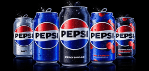
Soft drink companies, including PepsiCo, have been focusing on zero-sugar products and branding in recent years as consumer interest in full-sugar soda declines.
During a February analyst call, PepsiCo (PEP) CEO Ramon Laguarta stated that Zero “will be the centre of the strategy for the Pepsi brand” in the United States. Pepsi announced changes to its zero-sugar recipe earlier this year, and promoted the product with a Super Bowl commercial.
“We think that the non-sugar segment of colas will continue to grow very fast in this country. We’re seeing consumers pivoting,” Laguarta said, noting that zero had already been a “strategic” product in Europe and elsewhere.
Porcini told that “zero sugar is going to be the protagonist of our communication strategy.”
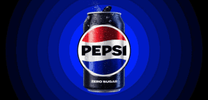
The new logo emphasises the zero line with black font and a black border, a nod to Pepsi Zero’s black can and label.
The border also contributes to the logo being defined as the focal point of the company’s new pulse campaign, which features lines radiating out of the pulsing logo in time with upbeat music in video ads and elsewhere.
Because the team is aware that even minor changes can cause uproar among customers, they approached the update with caution.
“This has been a iterative process over the last handful of years,” said Kaplan. “We think it’s a really great way to maintain [Pepsi’s] familiarity … but also project out to the future.”[/vc_column_text][/vc_column][/vc_row]