[vc_row][vc_column][vc_column_text dp_text_size=”size-4″]Nokia’s Chief Executive Pekka Lundmark claims that the shift results from Nokia no longer viewing itself as a smartphone firm but rather as a corporate technology company.
Nokia, a prominent mobile phone firm in the 2000s, recently announced a makeover, changing both its logo and corporate identity—the first such change for the company in more than 60 years.
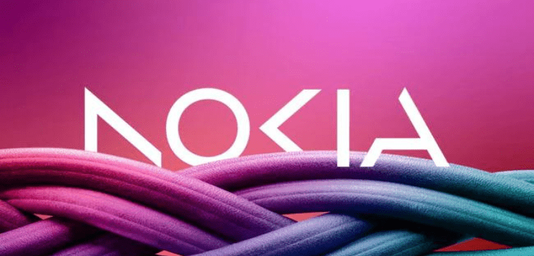
The new logo, which has a lettermark appearance, is composed of five distinct geometrical forms that form the word “Nokia” in a modern, streamlined design. The new logo features fresh colours and a new design, however it isn’t significantly different from the old one.
Also Read: Nokia’s new phones promise all-day battery life, low price.
The previous logo for Nokia was likewise a lettermark with the words “Nokia” printed in a large typeface and coloured in a startlingly serene blue hue.
Nokia’s mobile phone business will come to an end with this change in its logo and brand identification, according to information provided by the company, and it will transition into a business technology company.
According to Nokia CEO Pekka Lundmark, “There was the association to smartphones and today we are a business technology firm.”
At the Mobile World Congress (MWC), which was hosted in Barcelona and attended by officials from some of the top technical firms in the world, Nokia’s Chief Executive announced this announcement.
When Pekka Lundmark was appointed CEO of Nokia in 2020, the business, which had been suffering in the mobile phone industry for some time, announced that it had a straightforward three-step plan.
The company has successfully completed stage one, where it transitioned from being a mobile phone company to a business technology firm. These three stages were reset, accelerate, and scale.[/vc_column_text][/vc_column][/vc_row]