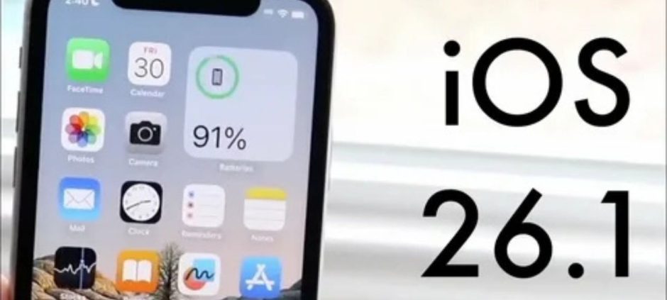
Apple has confirmed a major iPhone design fix in its latest update, iOS 26.1. The company is addressing the long-criticized “Liquid Glass” interface that made icons and text appear too transparent on some screens. This new update introduces a simpler, more readable layout that finally eases eye strain and boosts clarity for iPhone users.
The iPhone design fix includes a new “Reduce Transparency” toggle, letting users choose between the original glossy appearance and a more contrast-focused option. It’s a small but impactful addition that improves visibility, especially in bright light. Many users had been asking Apple to balance aesthetics with functionality, and this update seems to do exactly that.
Apple’s shift toward subtle design improvements also hints at a broader vision for the upcoming iPhone lineup. Reports suggest the next flagship, the iPhone 18 Pro, might arrive with more color options and refined design details. According to a recent report, the iPhone 18 Pro is rumored to launch in three colors, reflecting Apple’s growing focus on blending design consistency with user comfort.
The iPhone design fix in iOS 26.1 doesn’t stop at appearance. It also improves overall responsiveness, reduces animation lag, and refines the transition effects that felt too flashy in iOS 26. Apple calls this a user-driven update, one designed to make the interface “easier on the eyes” while maintaining the signature polished look.
Users can access the new design settings under Display & Brightness. The update is available for all compatible iPhones, and Apple recommends installing it promptly for a smoother and more stable experience.
The iPhone design fix in iOS 26.1 might not sound revolutionary, but it’s a meaningful shift toward a more practical and user-friendly Apple ecosystem, proving that sometimes, the smallest design corrections make the biggest difference.