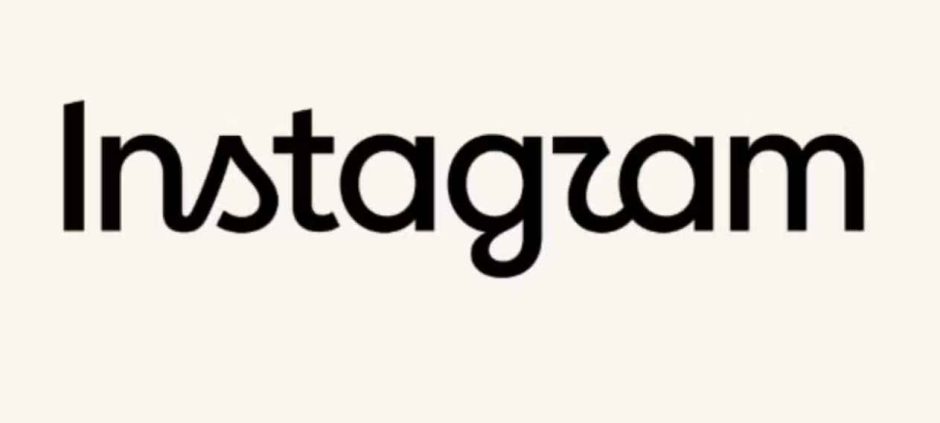
Instagram has introduced a new version of its wordmark after keeping the previous design for around ten years. The update changes the typography used for the brand name.
The company has not changed its well-known app icon. The familiar pink, orange, and purple gradient camera logo remains unchanged.
Instead, Instagram has focused on the way its name appears beside the icon. The main change is the introduction of a redesigned typeface.
The new font features softer curves and a more handwritten appearance. The differences can be seen clearly in several letters within the wordmark.
Letters such as “s,” “g,” and “r” have noticeable changes. The updated lettering gives the brand name a different visual style.
The redesign has already generated reactions across social media. Some users have joked about the unusual appearance of the new lettering.
Several online reactions compared the new wordmark to the spelling “Instagzam.” The comments have also led to memes and humorous posts.
Despite the criticism and jokes, Instagram says the change is part of a broader brand update. The company wants its visual identity to reflect its current direction.
Instagram chief Adam Mosseri announced the redesigned wordmark on the platform. He explained that the previous wordmark had been used for about a decade.
Mosseri said the company believed it was time to refresh the design. The new version retains some elements connected to Instagram’s original visual identity.
At the same time, the company aimed for a simpler and cleaner appearance. The updated lettering was also designed to better fit the platform’s current brand.
Mosseri later shared the new wordmark on Threads. He also invited users to share their reactions and opinions about the redesign.
The app’s most recognizable visual element has not been affected by the update. The gradient camera icon continues to use its existing design.
This means most users will notice only a small visual difference. The new typography will mainly appear when Instagram displays its full name.
The company has therefore made a limited change rather than a complete rebranding. Its familiar icon and color scheme remain part of the platform’s identity.
The timing of the update has also contributed to the online discussion. Instagram had kept its previous wordmark for approximately ten years.
Even a typography change can attract significant attention when a major brand changes its familiar appearance. The reactions show how recognizable Instagram’s visual identity has become.
The new wordmark is now part of Instagram’s updated branding. However, the company has kept the app icon that users know.
The redesign represents a relatively small change in appearance. Still, it has created considerable discussion across social media platforms.
In other related news also read Instagram Announces Awards for 25 Creative Users
For users, the biggest difference will be the updated lettering. The overall Instagram icon and its signature gradient remain the same.